Editorial art direction for a law firm: the abogados.pa case, measured
Case studyEditorialPanamáNext.js
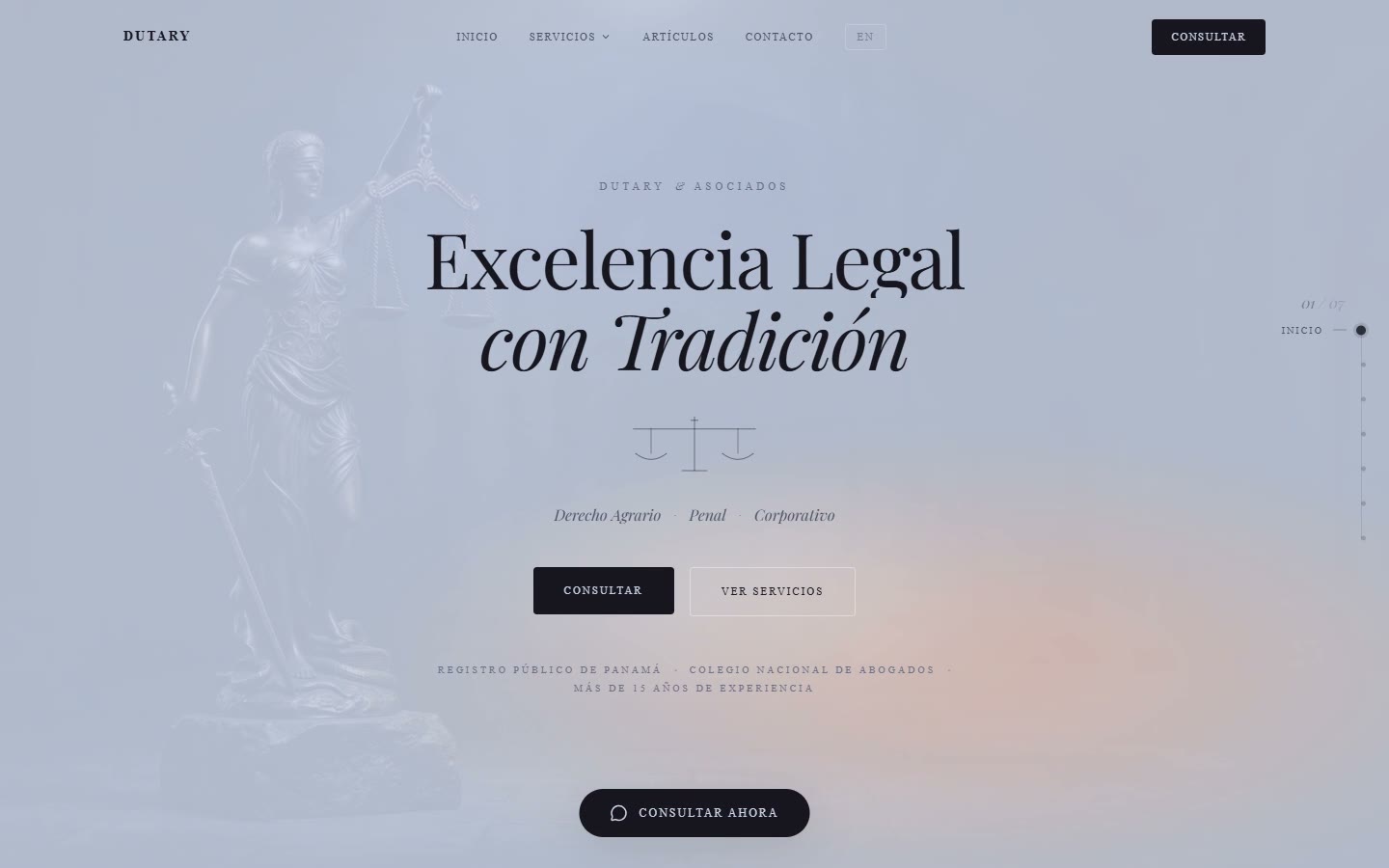
A firm in Panamá needed more than a stronger presence. It needed a website worth announcing. We gave it an editorial rhythm — serif headlines, long reads, motion that waits — and then we measured it.
Law firms do not need to look fast. They need to look certain. The brief was simple to say and hard to do: a digital presence that a partner would be proud to send to a client, and a launch worth telling people about. Our answer was editorial — the pace of a good magazine, not the pace of a landing page.
Serif headlines and a long-read rhythm
The headlines carry the tone: a serif with weight, set large, with room around it. Body copy is set for reading, not scanning, and each section arrives when you reach it, not before. The motion — GSAP and Lenis under Next 15 and React 19 — is there to make the reading feel unhurried; if you notice the motion, we did too much.
The site is deployed on the firm's own domain, on the stack we would choose for our own products: Next, Tailwind, a build that renders the pages ahead of time so the first thing a visitor gets is the page, not a spinner.
Certainty is also accessibility
A law firm's visitors include people who read with assistive technology, people on old phones and people in a hurry. An editorial layout earns its keep only if it holds up for all of them: real headings in order, text that stays text, contrast that passes, nothing that moves under the reader. The accessibility score is not a badge — it is the measure of whether the tone we designed reaches everyone the firm wants to reach.
What it measured
We publish the numbers because they are the part of the work you cannot see in a screenshot. Sixty-seven on mobile performance is honest for a page that opens with a large serif hero over imagery; zero layout shift is the number that matters to a reader, and it is the one we protect first.
// Project 01 in the route: Apr 2026, client website.
// Experience itRead the case on /work