Seven screens of vorluno.dev, taken apart: what each surface does, and the decision behind it
CraftMotionWebGLCase
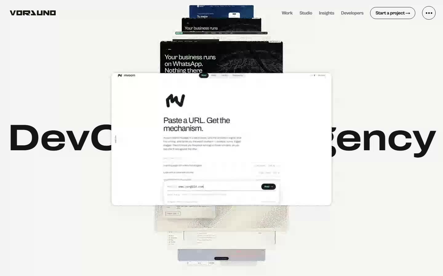
A site is not one idea, it is seven surfaces that have to agree with each other. Here is every screen of vorluno.dev recorded as it ships — the opening, the corridor of work, the studio, the menu, the writing, the developer index and the project form — with the engineering decision that made each one possible.
Most case studies show you the hero and stop. The hero is the easy part — it is one screen, seen once, with all the attention in the world. The hard part is the other six: the page a visitor reaches after they are already interested, the menu they open twice, the form they fill on a phone with one thumb. Those are the screens that decide whether a site is a demo or a business.
So we recorded all of them. Every clip below is vorluno.dev in production, captured in real time at 1440 × 900 — no mockups, no after-effects, no speed ramps. Under each one, the decision that the surface is built on.
01 — The opening: a stack you can grab
Seven real cases, stacked with physics. You can grab it, spin it and let it settle; hovering one card stops the rotation and plays that case. It is not a carousel between two states — the stack carries velocity and friction, which is why letting go feels like letting go.
The decision: the page never writes a frame when nothing changed. An idle stack is an idle GPU, and the videos stay at `preload="none"` until someone wants one. That is what makes a hero this heavy survive on a laptop battery.
02 — The corridor: work that arrives on its own
Open /work and the camera travels to the first case by itself, then hands the controls back to you. Each stop plays its own video — and only its own: one video alive at a time, the rest paused and rewound to their first frame, which is also their poster.
The decision: the entry journey cancels the moment you touch anything. Wheel, key, pointer, scrollbar — any of them stops the camera where it is. An animation that fights the visitor for control is worse than no animation.
03 — The studio: an exhibition, not an About page
Big things, a lot of air, and text that is revealed rather than shown: each line rises out of a mask, each hairline is drawn from the left, and when a block leaves the screen upwards it retreats the same way it came — the reverse of its own entrance, not a cut.
The decision: everything is visible without JavaScript and with reduced motion. The reveal is a progressive enhancement on top of a page that already reads. That is also why it is indexable: real headings, real text, server-rendered.
04 — The menu: a layer of ink underneath
The menu does not slide in over the page: the page lifts and an ink layer is uncovered beneath it, with the letters of the closing falling into place like blocks. Inside, the panel has its own smooth scrolling — nested, so the page behind it stays exactly where it was.
The decision: a stopped scroll engine still swallows the wheel. The panel had to declare itself and run a second instance of its own; without that, scrolling inside the menu did nothing at all. A bug you only find by using your own site.
05 — Insights: covers that start when you look at them
Every text has a cover: a real video of the thing it describes, or a generative composition built from our own colour system. On a desktop the cover plays when the cursor arrives; on a phone it plays when it is half on screen and pauses when it leaves.
The decision: the poster is also an attribute of the video. Without it the browser paints its own empty grey box for a moment before the first frame exists — and the video is only revealed once there is a frame to show. Small thing, and the difference between polished and rough on a phone.
06 — Developers: the numbers are read, not typed
developers.vorluno.dev lists our packages, repositories, MCP servers and engineering threads. Downloads and repository counts are not written by hand: a script reads them from GitHub, npm and PyPI and commits the snapshot, so the page is static, instant, and still honest about when it was measured.
The decision: search without a server. The index is built at compile time and shipped with the page; pressing `/` focuses it and results appear as you type, offline included.
07 — The project form: one question per plane
Starting a project is nine questions, and each one is a plane in the same world as the tunnel: the camera travels to the next question instead of scrolling a form. Your answers stay in your own browser, and the last step opens your email client with everything already written — nothing is sent until you press send.
The decision: the phone keyboard is not a change of scene. When it opens, the visible viewport loses half its height; re-measuring the world at that moment deformed everything while people were typing. Now it is ignored, the render loop rests, and on touch the whole thing runs without WebGL — the water effect only exists where there is a cursor.
What it all adds up to
One number we do not hide: mobile LCP is 4.3 s, because the opening holds the content until the title lands. We measured it, we chose it, and it sits next to the good numbers on the same page. A site is a set of decisions someone has to be willing to defend — that is the whole argument of this one.
// Experience itOpen vorluno.dev